I'm planning on putting up a couple minis for auction soonish, a farting bird (toot-oriole, get it?) about tools and equipment, and a page where you can access my tutorials without reading the whole damn blog, but for now I'm going to talk a bit on the philosophy of painting. I just spent a good 3 hours painting, I plan to toss another 1.5 hours at it before I call it quits, and I only just did some preliminary base work, finished up a face, and did about 68% of the leather on a model. All in all, only about 1/2 of a mini's total surface area. And mind you, this is a 30mm miniature, about 1.5 inches high tops. I'm not doing my BEST work, I'm doing good, accessible work. Do I sound like I'm bragging? I'm sorry.
Why do I spend so much time adding tonalities and layers that most people won't notice? That I can barely notice? The answer is that I like doing it. I like perfecting that one ridge, that one scar, gaunt cheeks, whatever. Adding a thin filter of color over cheeks and tips of ears to make them look suitably flushed is enjoyable. Sometimes I like doing quick work, it's a different challenge and I can just kind of let go and not care about smooth blends and the like, but sometimes the feeling grabs you and you have to push yourself to be as close to perfect as you can. At least, that happens to me.
So when you paint, all of you out there, don't care about how long you're taking. Care that you're doing what you want. When you look at a finished mini, I want you to see room for improvement, but I don't want you to have any regrets. If you think, "man, I should've pushed the highlights to be way more vibrant," or think "I should've spent more time on the base," or "this color scheme is really generic," that's what failure looks like. If your mini looks like shit but you took risks because you thought "man, this person looks grizzled, I'm gonna use a lot of grey in their skintones," you succeeded. Slap paint on your minis and just go until you feel some modicum of satisfaction, and then go even further.
And though I've not said it before, if you have questions or want advice or something, contact me. I'm happy to help. Pax.
Tuesday, September 20, 2016
Thursday, August 11, 2016
Zombicide: Black Plague Zombie Abomination
Sorry for the lack of updates. Painted up the Abomination from the Zombicide: Black Plague box set. Nice sculpts for one-piece board game minis, I have to say. Quick tabletop paintjob; maybe 3.5 hours total at the far outside. Did the Tamiya Clear Red + UHU Glue trick to add gross bloody bits; they look pretty boss.


More pics after the jump.
Friday, July 22, 2016
Malifaux Outcast Desperate Mercenary
I should really get better at taking pictures, but I'm lazy, so here's some raw photos. Tabletop paintjob, spent a little extra time on the base (I got into it and next thing I know, I'm adding layers of water and grass and moss). Maybe 6 hours total? It took a bit less than half a season of Agents of SHIELD.


Postscript: Let me just say that I like these Wyrd games minis. Very characterful sculpts, the prices are right (2 minis for like 13 bucks? Score!), and while I don't really like plastic (and their plastic casting is so-so only), they're good pieces. If you can fill a mold line or two, they're easy, and because of the dynamism in the sculpts, you can really create some atmosphere with little effort. 74% grade: good prices, nice sculpts, assembly and cast quality are so-so only, but the price is right.
Wednesday, July 13, 2016
A slightly more in-depth paint review: Warcolours.
So, I found this company on CoolMiniOrNot's forums, and I was intigued. Granted, this was mostly because they were, at the time, sending out free samples of their then-still in testing metallic copper paint, which is by far the best copper paint I've ever used. So I bought a couple more paints, and, well, after a painting hiatus, your paints dry up and die, especially those in poor-quality bottles (and yet I still have some perfectly fine GW screw-top bottles, go figure)...So I needed more paint. Got a fair selection of paints, a few metallics to bolster my stocks.
A few basics about Warcolours:
1. Their paints have no-nonsense names. A color (representing hue) and a number (representing lightness/darkness). This is nice, because honestly, what even are Orkhide Shade or Cryx Bane Highlight?
2. Their paints, along with the names, have a scale (looks like a cell signal) that lets you know approximately how opaque it is, which is very nice, especially when buying the paints. You know exactly what to expect when buying these paints.
 The primer coat is beat up, as it was a bit windy and it kind of fell onto the ground. no problems, though, it's a simple test.


A few basics about Warcolours:
1. Their paints have no-nonsense names. A color (representing hue) and a number (representing lightness/darkness). This is nice, because honestly, what even are Orkhide Shade or Cryx Bane Highlight?
2. Their paints, along with the names, have a scale (looks like a cell signal) that lets you know approximately how opaque it is, which is very nice, especially when buying the paints. You know exactly what to expect when buying these paints.
3. They are cheap. regular colors are 1.88 USD, metallics 2.43. Shipping is reasonable, though it tends to take a while as it's coming from Cyprus.
4. They come in dropper bottles. Some love them, some hate them, I'm ambivalent. Theirs are made of a little stiffer plastic than most, which some people don't like, but I do. They also have childproof caps, which might sway opinions, might not.
Testing:
Testing:
I started with a bit of scrap plasticard, which I primed. Black, then went over half with white. The white was Tamiya primer, which is super-fine and mostly intended for airbrushing over, so the first pass, you'll see the paint start to bead up a bit in places. Not a real concern, though.
 The primer coat is beat up, as it was a bit windy and it kind of fell onto the ground. no problems, though, it's a simple test.
Going with 1 coat of each. Left to right, I'm comparing Warcolours against Scale75, Vallejo, P3, and Games Workshop. One caveat: the paints were brushed on, straight from the pot, and I have some OLD pots of paint (like 15 years or so), so bear that in mind. Also, some paints behave differently when watered down: some need it, some respond poorly, etc. This is by no means exhaustive or definitive.
Colors used (left to right): Warcolours metallic black silver and metallic black gold, both 3/3 opacity; Scale75 black metal and necro gold. WC blue-grey 3 (3/3 opacity), pink 3 (2/3 opacity), and copper beta tester (don't have the production line copper); Vallejo Model Color azure. Vallejo Game Color warlord purple, and Vallejo Model Air copper. WC metallic antique gold, flesh 4 (3/3 opacity), and warm grey 5 (3/3 opacity); P3 rhulic gold, midlund flesh, bastion grey. WC Nostalgia 1988 woodland greeen, orange 1 (3/3 opacity); GW snot green, bronzed flesh.
So far, we can see SOME differences. Warcolours metallics seem to cover very well, but the opacity labeling doesn't seem to be too on. Also, you can see some of the beading I was talking about.

2 coats:
Now we're getting somewhere. Warcolours warm grey 5 and blue grey 3 are very nice. The beta test copper is by far the shiniest thing on there. Neither the pinks nor the fleshtones are covering too well, but that's, I suppose, to be expected. The '88 green is making me sad, though.

3 coats. Warcolours metallics are where it's at. Scale75 has them beat on luster, save for the copper which is bright and metallic and pretty. Warcolours flesh color is a bit pink for my tastes, and pink 3 is still very transparent, though to be fair only marginally more than its VGC counterpart. Finally, the nostalgia '88 is disheartening at best.
Overall impressions:
Warcolours are a high average. That is, their benchmarks are somewhere around those of Vallejo, which is pretty much the industry standard. They handle closer to Reaper Master Series paints, though, slightly...squishy-feeling, maybe, on the palette. The metallics are great, and from what I've used so far, very consistent. P3 was going to be my new go-to metallic, but some of the pots I got were lumpy and inconsistent, others great. Scale75 is wonderful but I'm not buying a set of 6 bottles every time I want another black metallic paint. Other colors are more hit-or-miss, I can't see much reason to use that woodland green, but otherwise, everything I have has a place in my repertoire of paints.
Pros:
Dry more slowly than most other paints
Dry pretty matte (similar to P3 paints)
Great selection of colors
Smooth, colors don't separate (only exception is the copper beta, and I'll accept separation for that level of pretty)
Names make perfect sense
Excellent range of metallics
Inexpensive
Cons:
Paints are hit-or-miss with coverage
Long shipping time to US
No ready-to-use fleshtone
Feel of the paints takes some getting used to
Overall, though, I'd give Warcolours paint approximately an 8/10. A solid B grade. A few areas of improvement, but overall great paints, well-priced, and with a quickly growing line of paints. Not going to say you should replace your whole paint set with Warcolors, but if there's a gap in your collection, you could do a lot worse. And at less than 2 bucks for a bottle of their basic paint, it's an affordable venture as well.
(yes, I'm an affiliate and I do get referral commission, this hasn't affected my review in any way.)
Edit: I just tried an impromptu durability test on my card. Warcolours paints are pretty durable, at the very least, more so than the rather fragile Vallejo colors This is the most unprofessional test I've done (took toothpick, needle, knife, ran across paint, the end), but hey, it's data.
Friday, July 8, 2016
I'm an insomniac: paint reviews.
No pictures (sorry), just text. Wanted to give some impressions about the paint I use.
Citadel Colours: The newest I have is Nihlakh or whatever oxide. Other than that, the old wash set and Foundation colors. They're not bad, but the drying agent in them and their cost make them low on my list. That said, GW colors aren't ever 'bad,' and their customer service is top-notch if you get a bad batch of paint. Overpriced and formulated for noobs, they're not worth your money.
Reaper Paints: I only have Master Series, the HD is too new and I frankly am OK with what I have. The colors are nice and consistent, good bottles with included agitators, but they feel 'squishy' to me. The binder, or some ingredient that effects the brushfeel, definitely gives these paints some character. That said, they're still very good. Some colors better than others, of course.
Vallejo: Game Color vs. Model Color, transparents vs others...Vallejo is a mixed bag. Some colors are invaluable, almost godlike in their range of uses...Others are shit. VGC Dark Green is honestly one of the worst colors ever. Metallics are grainy but earnest. VMC off-greys are some amazing colors, as is off-white. If you don't know what company to buy from, Vallejo is a good choice. Smoke is a near-necessity as well. Yes, these colors are a bit fragile, but that's why varnish exists.
Tamiya: How confused can I be? These colors all but expressly require specialized thinner, careful handling, and more. They work like love in an airbrush, and they dry super matte. Low working time, alcohol base...you need to do some work when working with these colors. Their clear colors are amazing. Tamiya clear red is all-but-necessary for good gore.
P3: My new staple, replacing Citadel. My only real gripe is that the metallics are inconsistent. Some feel like love itself, others are grainy and chunky. Large range, good prices, these are what I would call the 'standard' paints.
Scale75: Mostly only come in packs. This is my main problem, and the reason that were I numerically scoring these paints, they'd only be at 3/5. Literally the best metallics I've ever used. Skin colors are almost too matte, but that's not terribly important, because they're also indescribably amazing. All colors thin down in a really weird way.
Italieri: Only have a six-pack of these, but they're good. Opaque, creamy, good overall.
Iron Wind Metals: Seems they're discontinued. Their Ivory is an amazing color: off-white, covers well, dilutes well...Whoever they outsourced their paint to should be proud.
Warcolours: Their metallics are some of the best out there, so long as you use them right. Thin, slightly gel-like...ultra-matte, third only to Tamiya and Scale75. Also, cheap as hell, which is a big plus.
There are more, of course...But I figured I'd take my most-used colors and give an unbiased analysis of them. My favorite colors are GW graveyard earth and GW foundation charadon granite, and since they're both discontinued, I try to find replacements. Right now, I use a lot of VMC Grey Green and Brown Violet, as well as several P3 cryx bane shades.
But this is how I feel about paints. You, gentle reader, might find my recommendations terrible, and that's fine. It's just that these are how I personally react to several popular paint brands.
P.S.: Not even getting into washes and glazes and shit like that. That review comes much later, if at all.
Thursday, July 7, 2016
Realizing an urban base
So getting this posted took a bit longer than I hoped. Ah well.
Let's get right in to it, shall we?
I just started with a normal, regular slottabase, and added some milliput.

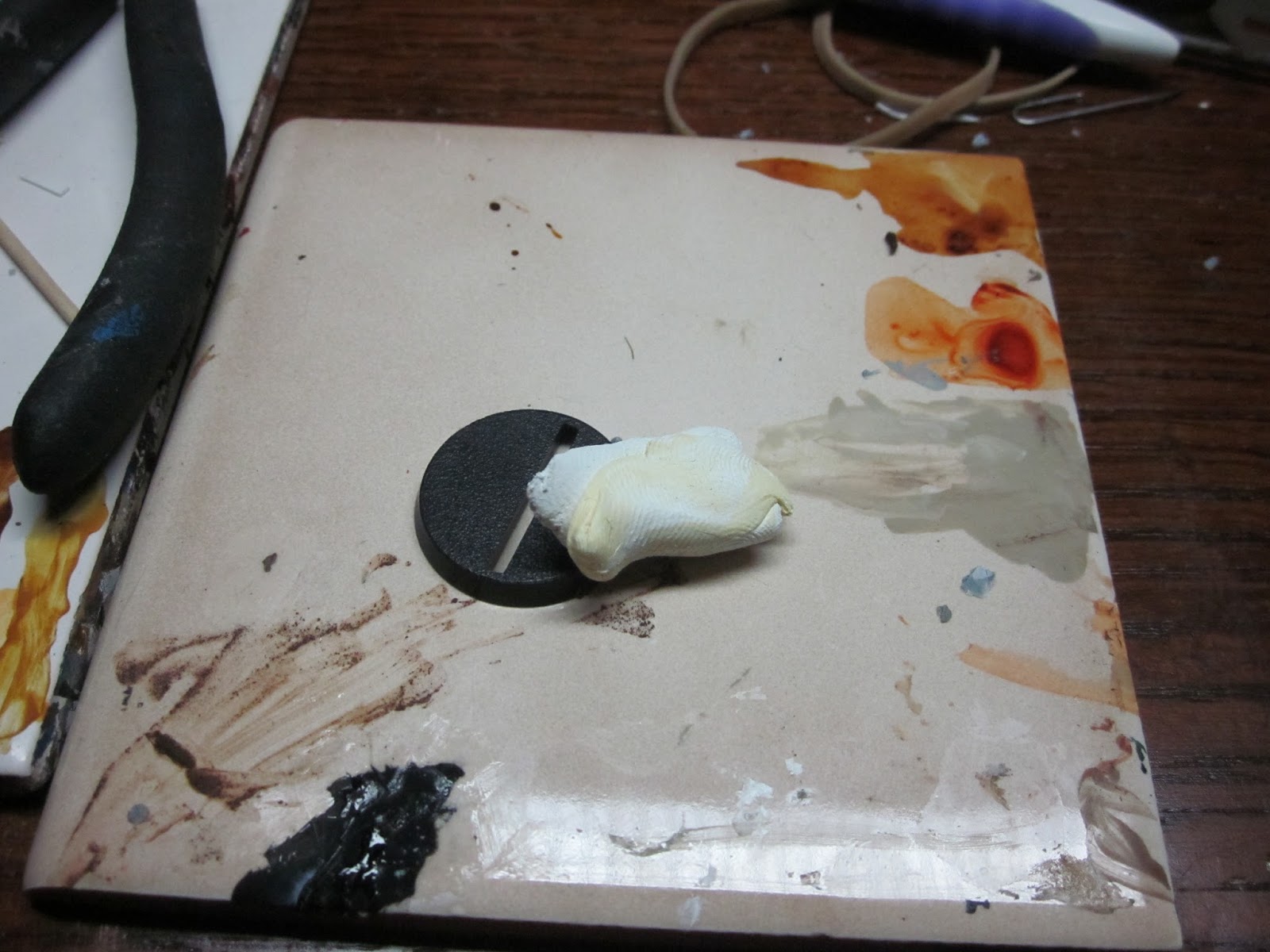

Shaped with a knife (just 2 intersecting lines, looks like the Smash Bros logo) and then added some texture with rock and scrap broken sculpey. Let it dry a bit before doing that, so you don't smush the design. The lines aren't, I don't think, perfectly perpendicular, which doesn't matter in the slightest. We talked about this, remember? Let it dry (3 or so hours?)

Sides sanded flush (or close enough to it.


Hole drilled, roughed up a bit with an x-acto knife.


Adding a little broken-off bolt like I talked about last time. Filed down the end of the paperclip (I'd used wire snips, and they tend to leave tented edges, I wanted it to look more like a bolt), tested fit for depth and then bent the clip using the hole as a fulcrum. With pliers, bent the wire to ~90 degrees, and clipped it. Easy matter after that to glue it into place.
 Primer coat. I usually use Vallejo primers because they're amazing and run perfectly thru an airbrush, but I don't have a respirator right now so I just spray-primed it outside. Rust-Oleum camouflage black (it's super-matte) with a light mist of Tamiya surface primer. I usually prime like this (white over black, that is) to help realize zenithal highlighting, but in this case, it's just to show detail and help paint stick.

Beginning to paint. For my basecoat, I use a shitty brush (for a base, you pretty much never need to break out your good brushes). Also, shot of wet palette before painting the base (OK, the grey base color is in there, bottom left).


I just used a couple old brushes, clipped down, to stipple the base. If you're going for fast tabletop, you can finish painting here (save for the metal bit), painting to this point was maybe 10 minutes, including taking pictures. But if you want something a bit punchier, follow along.

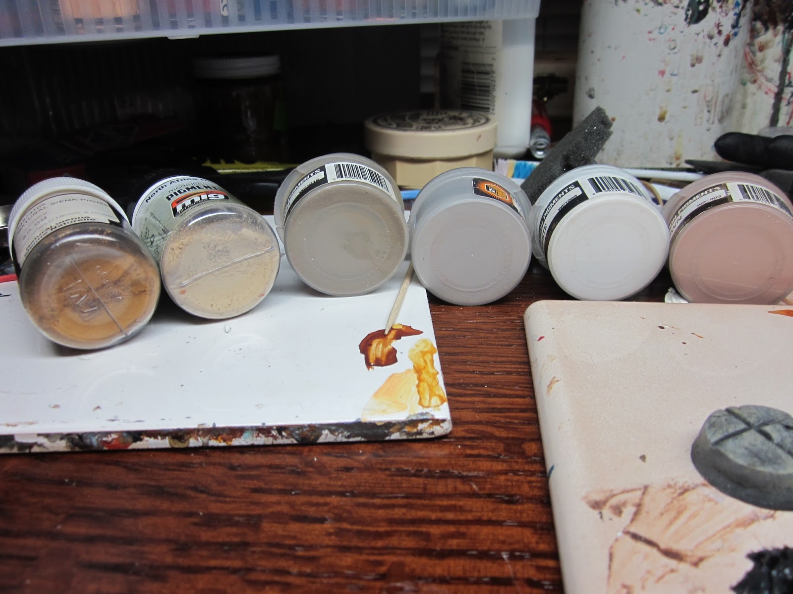
 Pigment powders are fun as hell, and the best friend of anyone doing bases. All these are sequential, but it's hard to state how incomplete this all is. I dab pigment on, add more, change colors, use it with water to form a pin wash of sorts, etc...Add pure white highlights and then buff it down...This isn't really finished, because I keep adding pigment as I go, whenever I feel like it's needed. It's kind of addictive, honestly.

Working on the metal bit now. It's tiny enough that painting is fairly unnecessary, so I just covered it in homemade rust pigments (with white glue as a binder). You can see that I went further with pigments on the base. Then it's time to add rust!


For good rust quickly, it's hard to beat ModelMates rust. It's hard to get here in the states, but well worth it. Water soluble, dries in a kaleidoscope of rusty oxidized hues, and workable even after dry. Fun as hell to work with, and even when used on a display-level miniature, its realism still holds up. You may have noticed the pencil in the background. If you buy metallic pigments, you're probably getting graphite. Rub the edge of a pencil on a surface and you'll get a dark metallic, very similar to metal peeking thru rust. Powder the lead and use your finger to hit larger surfaces. Works really well, looks realistic, and on larger surfaces, use the tip to draw little lines: they look exactly like scratches on a battered rusty surface.
At this point, I'm essentially done with the base, so I used a thin lacquer pigment fixative. Nothing major, just don't want to push anything around any more.


Remember the utility company's spray paint bits on the sidewalk? Of course you do. I'm prepping for those with some liquid mask. Dab on in random places with a bit of sponge, paint over it, and remove with a pencil eraser or your finger. You get a nice chipped effect that mimics chipped and worn-off paint very well. If you're going for a quicker method, you can just use a color that appears on the base and sponge that over something written. But I'm trying to showcase a lot of techniques here, so I'm using masking fluid.

markings on base. No WIP shots because this was a quick thing: using very thinned paint, I drew what you see here. I then went over those lines with lighter paints. Tried to keep all the paints very thin because I wanted it to be slightly translucent, to mimic the feathered edges of spray paint. Did break out a good brush for this, because it's detail work and I didn't want to cock it up.


After removing the mask. Notice the white glue down there? That's important for the next step.


Stains are neat. And I learned at a young age that white glue dries from the outside in, leaving a film
on top and a ring around the edges (who DIDN'T put white glue on their hands, let it dry, and peel it off?). So I mix white glue, a color wash (Secret Weapon's Baby Poop, in this instance), and water, and make a staining liquid. After a bit on the base (no more than 5-10 minutes, I use a bit of paper towel (rolled into a point) and remove as much liquid as will readily absorb. Let the rest dry, and you get a very nice stain, with tide marks and everything. You can apply this multiple times, overlapping, if you want, for example, an old, well-used alchemist's laboratory, or a dirty, blood-stained torture cellar.
Almost done. Just wanted to add some color modulation and bits of discarded chewing gum.


First of all, I added a very thin wash of Secret Weapon's Soft Body Black to one of the panels to darken it, used a bit more to accentuate the cracks. Not terribly visible, but it makes a difference, especially in real life.
Mixed Payne's Grey with some gel medium for body, and placed a couple blobs down. Highlighted with dark grey, then washed it with Vallejo smoke (great multipurpose color, that). Not all of those steps were recorded, the smoke wash for sure comes after the above images. Were there to be a miniature on this base, I'd have arranged the dots to help draw the eye to the miniature, same with the utility company markings.
And a lot of the stuff on this base was done with a humble toothpick. Applying pin washes to cracks, placing blobs of 'gum,' applying some of the pigments, etc. I use sharpened toothpicks to paint in pupils, too. Buy a box. It's like 250 toothpicks for 2 bucks. One of the best tools out there, bar none.
And the final product:


Haven't used dullcote to kill the shine, but this is the finished product. about 1.5 hours of painting, including photos. Sculpting was probably a mere 5 minutes; if you include adding the bolt, 10? Working in bulk, the time doesn't increase as a direct function of amount, because you've already got tools out, colors mixed, among other things. And as a base, you can just add bits as your miniature dries, or whatever. Painting a base like this, so long as you take a moment to plan what you want for it, shouldn't add more than an hour to a miniature's completion time. If you go the simple route (stippled colors, maybe a wash to bring out the detail, and a single detail element), I couldn't imagine it taking more than 20 minutes or so, which can be squeezed into downtime when working on the miniature occupying the base. Here's my wet palette after this (not much painting done, but notice the changes from the 'before' image above.):

Using individual colors is a sucker's game. Even Foundry's triad system can't cover everything, and while using a hundred glazes to blend colors works, it's a lot of effort. If you want to highlight something, mix up a lighter variant of the color, don't just use a new light color. If you make a mistake (which I did multiple times on this base, I started with too cool a grey, I went straight to a straw yellow, etc.), just mix it back down and see where you go from there. If all the colors have a bit of the others in them, chances are your end result will look far more harmonious.
So that's it, I guess, for my first step-by-step tutorial. I hope it helps add some techniques to your toolbox, and to look at things in a different light. I realized just now, as I write this, that I originally intended to put some grass and lichen on the base, coming through the cracks, but it's a bit late for that. Not that I can't do it (they're both easy to do, I'll cover it later), but the base is, to me, 'complete,' and I don't want to fuck that up. Another mistake. What did Bob Ross call them? Happy little accidents? I have at least one an hour when I paint, and even my tabletop miniatures take 3-4 hours. Don't sweat it if something goes wrong. So long as you didn't sand off a miniature's face, you're fine.
Also, I recommended getting a pack of toothpicks. For stuff like this (as well as working with pigment powders), a stippling brush is an invaluable tool as well. Don't buy one. Either buy a cheap-ass round brush, or take a round brush that's pretty much dead, and cut the bristles down to about a quarter inch. Bam. Stippling brush. Cheap, stiff hairs work best for this kind of brush, so boar or synthetic actually makes a better tool than badger or sable. I have a specialized stippling brush or two, but I still use my clipped-down 3-dollar synthetic brush for a good 85% of my purposes.
Next time: I have no idea. I'd like to go over glazes and washes, but we'll see where the future takes us. As the folks at Massive Voodoo say, keep on happy painting! (the MV-team is probably the reason I have this blog, and their tutorials are godlike. If the only thing you get from my site is that link, you're already on your way to becoming a better artist).
PS: I use a LOT of parenthetical clauses. It's a weird habit of mine. Is it distracting, or does it give my writing character? Or something else?
Subscribe to:
Posts (Atom)